As Timeland, the 2010 Alberta Biennial of Contemporary Art, provoked an ongoing provincial dialogue about identities and regional representations, its accompanying panel discussion did little to shed light on the laudable and the discordant elements of the exhibition.
The discussion itself began with moderator Robert Enright’s introduction on place and identity (via a throwback to Northrop Frye) and brought together some all-too-familiar faces to shed light on the exhibition . . .
First published in Galleries West. Click through to read in full.
Sunday, September 19, 2010
Q & A: RICHARD RHODES CURATOR OF TIMELAND: 2010 ALBERTA BIENNIAL OF CONTEMPORARY ART
Amy Fung: From the Timeland catalogue, the voice you assume is very much about being an outsider coming in, traveling to this land, and really decentering the center of the art world, which is basically Toronto in Canada.
Richard Rhodes: I don’t believe in centres anymore. I believe technology decenters everything. There are still centres that have everything and that people still aspire to, like the Toronto art scene for instance, it aspires to New York, London, or Berlin, but that’s pathetically self-colonized . . .
First published in Galleries West Fall 2010. Click through the title to read in full.
Thursday, September 16, 2010
Prairie Artsters: Going Out on A High Note*

VUE WEEKLY: How's Notebook been going for the past while?
STEVEN TEEUWSEN: I haven't put out an issue since January and I stopped paying myself. I was waiting on funding, but that's not sustainable, unless I sell a lot of advertising. I've fallen behind on that, partially because I'm burnt out. A lot of people warned me about burning out when I started, but I didn't give it much thought. I thought it was an excuse for being lazy! Now, I think it's very real.
VW: What was the total lifespan of Notebook?
ST: The first issue was out by January 2007. This will be the 12th issue, and final one. I'm really proud of them on the book shelf. I definitely have mixed emotions. It's bittersweet. I'm really excited to be able to work on something else, but the print magazine was something special too. When I started, I wanted to work on it for three to four years, and I've done that, and I was able to work full time at it for the better part of that time.
VW: What were some of your personal highlights?
ST: Getting distribution through Magazines Canada and getting it on the shelves from coast to coast was really satisfying. Especially for the younger artists, like Jesse Tempest, who moved out to Halifax to attend NSCAD and her work was out there before she even arrived.
It's also been great how people have contacted me from across Canada about the magazine. It's progressed a lot visually from my first issue which looked like a high school project. It's come a long way.
VW: What were some surprising challenges?
ST: Copyediting was never something I gave much thought to until you see it in print, and you can't go back and it's staring at you every time you open the magazine.
So much of it was new to me, that it all had the feel of throwing myself in, from booking venues, approaching people about advertising. It was intimidating at times, but people were so positive.
Part of me wishes I was more self-motivated all the time. When I started it I could work all day and all night and I had a lot of energy. As it progressed I ended up knowing how to do things better, but procrastinated on other things, like selling advertising. I have no major regrets—there's ways it could have been managed better, but I'm so happy with how far it's come. When I started I had this idea that it would be this interactive collective, and if I could have shown myself the 12 issues then ... it's definitely better than I thought it would have been.
VW: Well it's not the end.
ST: No, it's not the end. After wrapping up this issue and the distribution and finishing up subscriptions, I'm organizing for new online content to appear each week. It is the evolution of the project and it is environmentally more friendly. It was always disheartening when the covers are ripped off and sent back to you if they didn't sell.
It's meant a lot to me that people have expressed how much they appreciate being able to show their work around Edmonton and across Canada. It's definitely been a really fulfilling project to do as your work-a-day hours
www.notebookmagazine.ca
*First published in Vue Weekly
Thursday, September 9, 2010
Retrospective on JC Heywood, A Life in Layers, FAB Gallery, until Sept 25, 2010*
An extensive retrospective on one of Canada's most respected printmakers, Carl Heywood, opens the season for the University of Alberta's Fine Arts Building Gallery, where he has worked with students and faculty alike over the course of 40 years.
Organized by the Burnaby Art Gallery, A Life in Layers chronicles Heywood's artistic practice and life, from growing up in Ontario to moving to Paris to work at the infamous Atelier 17 with SW Hayter, studying and living in Germany to Japan, and his devotion to the multifaceted possibilities of printmaking.
Heywood's works are recognizable at first instance, with a bold use of colour that can only be summed up as painterly. A chameleon in artistic range within the faithful folds of print, Heywood's career is one that changes, evolves and grows with a mind that is both knowledgeable and curious.
Heywood is a print artist where the hand is still very much present, as best exemplified in his series of working with oil stick on mylar. Working across styles mastered from dry point to giclée, lithography, chine collé to even experiments in 3-D media, the illustrative side reveals itself, often through the brilliance of bold colours.
The UV screen prints are spectacular in person, where the layering of patterns and colours and techniques are not just blended, but are discrete zones of detail coexisting together in harmony. There is a finesse to their presence that no reproduction can conjure, filled with the subtlety and intricacies of tonal variations.
As the first major retrospective of Heywood's works, the original exhibition at Burnaby featured 76 of Heywood's pieces spanning over 40 years of pushing the techniques and processes of the never-ending curiosities of printmaking. With a wide and varied practice from his realistic still-life prints that modernized the Old Dutch Masters, to his collage mentality most noted in his suite to Kurt Schwitters, to the influence German or Japanese techniques had on him, the one clear line through the endless maze of Heywood is his respect and integration of the knowledge he has sought and his integration into a voice that is uniquely his own. There is a dynamic energy to his works that does not shy from his points of inspiration, whether it is Manet or Picasso, and he has a voice that holds true, as evident with the passing of time.
Accompanied by a handsome catalogue edited by curator Geraldine Davis, the show becomes illuminated with personal interviews, essays and full-colour reproductions of some of the key works throughout Heywood's lifetime.
*First published in Vue Weekly
Organized by the Burnaby Art Gallery, A Life in Layers chronicles Heywood's artistic practice and life, from growing up in Ontario to moving to Paris to work at the infamous Atelier 17 with SW Hayter, studying and living in Germany to Japan, and his devotion to the multifaceted possibilities of printmaking.
Heywood's works are recognizable at first instance, with a bold use of colour that can only be summed up as painterly. A chameleon in artistic range within the faithful folds of print, Heywood's career is one that changes, evolves and grows with a mind that is both knowledgeable and curious.
Heywood is a print artist where the hand is still very much present, as best exemplified in his series of working with oil stick on mylar. Working across styles mastered from dry point to giclée, lithography, chine collé to even experiments in 3-D media, the illustrative side reveals itself, often through the brilliance of bold colours.
The UV screen prints are spectacular in person, where the layering of patterns and colours and techniques are not just blended, but are discrete zones of detail coexisting together in harmony. There is a finesse to their presence that no reproduction can conjure, filled with the subtlety and intricacies of tonal variations.
 | |||||
| Image credit: J.C. Heywood, "Carpe Diem II" 2002 |
Accompanied by a handsome catalogue edited by curator Geraldine Davis, the show becomes illuminated with personal interviews, essays and full-colour reproductions of some of the key works throughout Heywood's lifetime.
*First published in Vue Weekly
Wednesday, September 8, 2010
Interview with Richard Rhodes for Timeland, The 2010 Alberta Biennial of Contemporary Art
The meat of the interview can be found in the pages of the Fall 2010 issue of Galleries West, but we talked for close to an hour during the Timeland install and many topics were brought up. Here are some excerpts about technology, formalism, and landscapes that didn't make the final cut.
Excerpt from Danny Singer's "Rockyford"
Amy Fung: How does technology factor into the physical curation of this show?
Richard Rhodes: I think once you come to things with a consciousness of the syncrhonicity that technology brings to the culture in general, then what I hope in the end result is that it allows you to pick a lot of different types of art, because the same principles of synchronicity happen within the art world.
For example, David Cantine’s career was in large part structured on the fact that he wasn’t quite a formalist--that he was an impure formalist. In the context of this show, who’s the formalist? John Will has made a career out of painting a dislike of painting, a skepticism of practice of producing high art, well, who occupies the most space in this show? John Will! With a whole clutch of younger artists, all are whom are fiercely contemporary in their own sense, and in the same sense are completely framed by John’s own skepticism towards the art world.
I don’t think the links are linear; they are atmospheric, and that’s what’s interesting to me.
AF: Let’s talk about the younger artists in this show. You’ve consciously chosen to include a host of young emerging artists alongside these established artists?
RR: The whole interest in doing a biennial--for me--is to introduce this notion of a cross generation biennial. Artists don’t stop making work depending on how old they are nor does an artist in the 5th decade or 6th have a wall between them and topicality; but the very fact that you’re a 30 year old artist--I don’t think--privileges newness in any way.
For me, it was an real point that this biennial was impart cross generation, that idea of old and new, young and old, has community roots too, and you can’t build a community of artists if the artists can’t survive their own generation. Otherwise you have one generation of artists killing off a succeeding generation of artists.
AF: That reminds me of the history of Edmonton’s modernism and formalism and its legacy, that in 2010, are still pervasive.
RR: And that ultimately is not constructive.
It’s so interesting to see how that works into the younger work, because never have I been more impressed by the work ethic among artists than I have coming here to Alberta. The amount of time and attention that goes into making the work here is phenomenal to notice.
AF: You trace this back to formalism?
RR: I do, absolutely. That carefulness, that closeness of looking, that whole pace. Formalism has a pace to it, and it’s part and parcel of what we’re seeing by the intricacies that are across the board at the work here even when it’s hanging by pins and it’s just a wash, it’s still done out of a fairly intricate process and I think that’s a kind of orphan legacy of Alberta formalism. And in the long run, its most constructive aspect.
I’m sure Allan Dunning and Paul Woodrow would freak out at the concept that they would owe formalism anything, but culture sets up these clouds of being, ways of interacting, pressures of labour, and all these things about how we think about an atmosphere actually go into how we think of culture. It’s full of ephemeras, full of things that have no hard edges.
AF: I wanted to go back to the reoccurring theme of “ghost” that kept on being mentioned in your studio visits.
RR: Not a theme, but a word that was just mentioned repeatedly. There was no uniformity, there was no one ghost, it was a consciousness of ephemerals at play. It’s not a ghost so much as a haunting. There’s this historical legacy that’s very much in the air. A historical legacy that gets lived out in the landscape. I mean just to going down into that river valley is to feel some sort of primordial space that interrupts you. You come with this very comfortable middle class head space and suddenly, you have this river that looks like it’s hundreds of miles, bearing traces of a landscape that is not one ounce urbanized.
AF: I find it interesting how Canadian art on the world stage is almost always Aboriginal or Group of Seven or something dealing with "iconic" landscapes. But when you bring it back to the Alberta Biennial, there is no trace of the iconocisms of landscape that Canadian art is known for.
RR: The kind of landscapes that figures in this show is the interactive landscape that modern development has brought. It’s land that has been redefined by all of our anxieties about climate change, even though you are swallowed whole by landscape. All of us are conscious of its vulnerabilities, even if it can swallow you whole, we are conscious of it as a vulnerable entity, certainly in Rita’s piece, Walter’s work, Paul’s paintings, David’s photographs, the landscape has turned, and it’s our responsibility. Most of the landscape orientated art takes a position that the landscape is our responsibility. That’s what comes through and that’s a really interesting sign that artists working across generations are sharing a same point of view.
Excerpt from Danny Singer's "Rockyford"
Amy Fung: How does technology factor into the physical curation of this show?
Richard Rhodes: I think once you come to things with a consciousness of the syncrhonicity that technology brings to the culture in general, then what I hope in the end result is that it allows you to pick a lot of different types of art, because the same principles of synchronicity happen within the art world.
For example, David Cantine’s career was in large part structured on the fact that he wasn’t quite a formalist--that he was an impure formalist. In the context of this show, who’s the formalist? John Will has made a career out of painting a dislike of painting, a skepticism of practice of producing high art, well, who occupies the most space in this show? John Will! With a whole clutch of younger artists, all are whom are fiercely contemporary in their own sense, and in the same sense are completely framed by John’s own skepticism towards the art world.
I don’t think the links are linear; they are atmospheric, and that’s what’s interesting to me.
AF: Let’s talk about the younger artists in this show. You’ve consciously chosen to include a host of young emerging artists alongside these established artists?
RR: The whole interest in doing a biennial--for me--is to introduce this notion of a cross generation biennial. Artists don’t stop making work depending on how old they are nor does an artist in the 5th decade or 6th have a wall between them and topicality; but the very fact that you’re a 30 year old artist--I don’t think--privileges newness in any way.
For me, it was an real point that this biennial was impart cross generation, that idea of old and new, young and old, has community roots too, and you can’t build a community of artists if the artists can’t survive their own generation. Otherwise you have one generation of artists killing off a succeeding generation of artists.
AF: That reminds me of the history of Edmonton’s modernism and formalism and its legacy, that in 2010, are still pervasive.
RR: And that ultimately is not constructive.
It’s so interesting to see how that works into the younger work, because never have I been more impressed by the work ethic among artists than I have coming here to Alberta. The amount of time and attention that goes into making the work here is phenomenal to notice.
AF: You trace this back to formalism?
RR: I do, absolutely. That carefulness, that closeness of looking, that whole pace. Formalism has a pace to it, and it’s part and parcel of what we’re seeing by the intricacies that are across the board at the work here even when it’s hanging by pins and it’s just a wash, it’s still done out of a fairly intricate process and I think that’s a kind of orphan legacy of Alberta formalism. And in the long run, its most constructive aspect.
I’m sure Allan Dunning and Paul Woodrow would freak out at the concept that they would owe formalism anything, but culture sets up these clouds of being, ways of interacting, pressures of labour, and all these things about how we think about an atmosphere actually go into how we think of culture. It’s full of ephemeras, full of things that have no hard edges.
 | |||
| Image credit: Chris Millar, Bejeweled Double Festooned Plus Skull for Girls. Photo Courtesy of Trepanier Baer Gallery, John Dean |
RR: Not a theme, but a word that was just mentioned repeatedly. There was no uniformity, there was no one ghost, it was a consciousness of ephemerals at play. It’s not a ghost so much as a haunting. There’s this historical legacy that’s very much in the air. A historical legacy that gets lived out in the landscape. I mean just to going down into that river valley is to feel some sort of primordial space that interrupts you. You come with this very comfortable middle class head space and suddenly, you have this river that looks like it’s hundreds of miles, bearing traces of a landscape that is not one ounce urbanized.
AF: I find it interesting how Canadian art on the world stage is almost always Aboriginal or Group of Seven or something dealing with "iconic" landscapes. But when you bring it back to the Alberta Biennial, there is no trace of the iconocisms of landscape that Canadian art is known for.
RR: The kind of landscapes that figures in this show is the interactive landscape that modern development has brought. It’s land that has been redefined by all of our anxieties about climate change, even though you are swallowed whole by landscape. All of us are conscious of its vulnerabilities, even if it can swallow you whole, we are conscious of it as a vulnerable entity, certainly in Rita’s piece, Walter’s work, Paul’s paintings, David’s photographs, the landscape has turned, and it’s our responsibility. Most of the landscape orientated art takes a position that the landscape is our responsibility. That’s what comes through and that’s a really interesting sign that artists working across generations are sharing a same point of view.
Thursday, September 2, 2010
Reframing a Nation, Art Gallery of Alberta, until January 30, 2011*
 |
| Image credit: Franklin Carmichael "Sombre Valley" 1936. Oil on masonite |
Culling from the AGA's permanent collection, Reframing a Nation gathers together a series of recognizable landscape painters and attempts to question how they have represented the nation's identity. While this is certainly not a new idea—and it is a valid one—the concept only hits home if the show begs a greater understanding of how representation, identity and legacy are closely intertwined.
Unfortunately, after spending an afternoon with this show, I do not sense an understanding, or even a coherent statement, within this assemblage of works that provokes or furthers how we view and shape our Canadian art history and identity.
First off, it was surprising to see the show spread out in such a large space, as the bones of the show could have been summarized in 12 or less paintings. Beginning with 19th century oil paintings of Quebec and Ontario and European settlers' first contact with First Nations people, Canadian wildlife and the vastness of space, it is clear and obvious that we are seeing the new country through old world eyes in examples of Otto Reinhold Jacobi and Maurice Cullen and their treatments of composition and light. But embedded within this early work, from the bronze statues of women walking through an open clearing and the repeated mist of clear, unfiltered light, there is the underpinning of a Canadian esthetic at work, one that is evidently shaped through the presence of wind and latitude.
The show as a whole does not nurture this aspect, or show how representation of Canadian landscapes have evolved, as the exhibition simply levels out with the preapproved accreditations of David Milne and the The Group of Seven.
If the show proposes to re-engage how Canada has been represented and how Canadians continue to view ourselves, the answer, accordingly to the works on the wall, would be "very safely." Not only does this show suggest that we still see, promote and understand Canada through a 20th century romantic-yet mastery-Eurocentric lens, but we are still most engaged in representations of Upper and Lower Canada with a minor dash of the Rockies, the West Coast and the Artic for good measure. The uneveness of this show and its decision to rehash the art history textbook reading of a wild yet controlled Canadian landscape without offering much of a contrast is certainly questionable, as there is a conflicting attempt to inject contemporary perspectives with a commission by photographer Maria Hupfield and a juxtaosition with abstract painter Jack Bush.
 |
| Image credit: Cornelius Krieghoff Indian Trappers Group, no date Oil on Canvas |
Hupfield, who showed a similar work in the Face the Nation exhibition, (which was a far more successful and unmitigated reframing of the nation through the perspectives of contemporary Aboriginal artists), is awkwardly placed in a back corner behind the Lismers and Varleys, which is disappointing as her piece directly responds to the limited perspectives of those very paintings and traditions.
But these are not the only discrepancies, as the show is also divided somewhat by panels, one suggesting "Wilderness" and another in the "Industrial" landscape. But the show still somehow overlooks the fact that Tom Thomson and Emily Carr were preoccupied with the rapid industrialization of their landscapes through evident interest in the logging industry and clear cutting? Why keep them in the context of the romantic wild in a show that is supposedly attempting to reframe how we see the construction of this country?
It's sad to say, but the overall sentiment of the show is that there isn't one, which seems to be the perpetual problem of locating Canadian art history and consequently, Canadian identity.
*First published in Vue Weekly
Prairie Artsters: Jeff Haslam vs. The Social Media World*
Not to beat a dead horse back to life, but the recent Jeff Haslam versus The Social Media World is still running through my mind. For those who stayed out of the fray, here's a brief summary: Sharon Yeo has a blog, Only Here For The Food. Writing down her thoughts about various events in Edmonton, from festivals and social mixers to attending live theatre, Yeo updates her blog steadily with descriptions and opinions about things she liked and didn't like about what she ate, and what she experienced. The entries are immediate and unprocessed, but they are regular and consistent in tone and voice. They don't say all that much, and yet, her writing has raised the ire of local theatre actor Jeff Haslam.
Apparently, Yeo's writing has been a throbbing thorn in Haslam's side for some time, resulting in an outburst where he publicly called her "snotty," "arrogant," "weird" and "a pretentious doof." By publicly, I mean he left a comment on her blog, directly below her last review of a Teatro la Quindicina production, where Haslam serves as artistic director, besides acting and sitting on the board.
During the Fringe of all times, the story of Haslam's outburst exploded into a series of tangents ranging from the impact of social media to last weekend's story in The Globe and Mail that skinned Haslam alive for coming across as ungrateful and arrogant, and framed the incident as the perfect example of what not to do with bad press.
Only, what Yeo wrote can barely be considered as press, let alone bad press. Yeo is keeping an online journal of her experiences and memories, which includes going to the theatre, for all who care to read along. It's a public journal, but it's still in the format of a journal, which means she's writing mostly for herself.
The fallout of Haslam's poorly timed outburst is that there's now a lot of negative press—although he's apparently now sent a hand-written apology to Yeo—but the irritating thing is that it's now directed at Haslam. If anything should be closely examined here, it should be the shows themselves.
Calling Haslam arrogant and rude is true enough, but will it make the theatre shows any better? Certainly his attitude in asking Yeo to take her business elsewhere is not going to improve the quality of the shows either, but this is the part in the whole story that worries me the most.
There's an unspoken rule in the print world that you never run a bad review on a first-impressions basis. If there is something inherently negative that needs to be said, it needs to be reinforced by more than one experience, which gives the story and writer some ethical credibility. In an age of online and self-publishing, instantaneity has been given more privilege than accuracy. That is an easy dismissal, and Yeo's writing does not offer much in terms of depth or insight. However, she has been a regular theatregoer for close to 10 years, and Teatro is one of her regular haunts. If a devoted regular is saying something that's hitting a nerve, there's probably something to it.
*First published in Vue Weekly
Wednesday, September 1, 2010
Some thoughts on Canadian Art in 2010
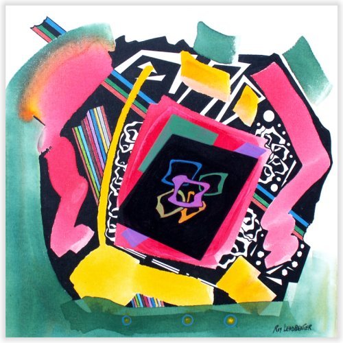 |
| Image credit: Roy Leadbeater, Deep Space Butterfly 24"W x 24"H Acrylic on canvas |
I unexpectedly had tea with Roy Leadbeater this afternoon, and I’ll admit I only knew him by name until now.
His works are around town, the dancing musical fence along 104 St and 102 St, the big blue sculpture outside of the Citadel, the recognizable abstract shapes and primary colours, recognizable but also very different in how we treat steel (especially around these parts).
He’s led quite a life, from being a direct descendant to the famous Wedgewood potters in England to working as a marine engineer to posting as an officer in the Middle East, he’s 82 and still painting every day, and making sculptures on commission.
He said something that needs a bit of unpacking, besides a quick quip that the sky here reminds him of being at sea going nine knots, and that is he doesn’t consider himself a Canadian artist, because he’s too cosmopolitan. Simply put, he’s not interested in landscapes.
His sentiment can be taken as a joke, and it is the ongoing joke about Canadian art that stopped being funny, but I’m pretty sure he was quite serious about defining himself as not a Canadian artist based on this criteria.
The cache of a Canadian artist from an international lens is exoticized still, not always, but because we still don’t know how to define ourselves, Canadian art on the international stage looks like a travel brochure. Intangible wilderness that is pristine, yet controlled, and Aboriginal representation that is acutely subverting the traditonal. The main problem with a travel brochure is not the quality of its contents, but its lack of complexity--and diversity--in suturing contemporary issues with its own mired history.
I can't get a grasp of a "Canadian" aesthetic, as I tend to favour the regional approach, and Leadbeater for all of his international panache fits into this category, with his focus on the mechanics of space, his inspiration from engineering, his time in the oil industry, his preference for materials and methods that is innately industry-driven. They are also done from the perspective of the workers. There are ties to other revolutionary working class styles, early Russian abstract works, hints of Futurism. And by his intimate knowledge of Picasso’s life stories, Cubism and the thoughts behind that, the notion of absurding the representational, the status quo, remain alive in his Alberta-based work.
Subscribe to:
Posts (Atom)